This project is a capstone project from the UI/UX Design Specialization by California Institute of the Arts (CalArts). It revolves around designing an intuitive and user-friendly digital experience for BubbleUp, a boba tea restaurant. The project focuses on creating a seamless online ordering platform for users to customize and order their favorite drinks, emphasizing user convenience, customization, and efficient delivery.
- Project Duration: July - September 2024
- My Role: UI/UX Designer & Product Designer
- My Responsibilities: Conducting user research, developing personas, and defining the app’s information architecture, paper and digital wire-framing, low and high-fidelity prototyping. I designed the logo, user interface and interactive elements, including the drink customization system and order tracking feature, while ensuring a mobile-optimized experience.
BubbleUp is a modern, on-the-go boba tea shop that focuses on delivering fully customizable drinks tailored to individual tastes. The concept revolves around providing a fast, convenient, and fun experience, where customers can mix and match tea bases, flavors, and toppings, creating unique combinations that fit their preferences, all while emphasizing quick delivery to college students and busy professionals.
“Say hey to BubbleUp, the ultimate boba hookup that delivers your fave bubble tea straight to your door. No lines, no wait—just pure boba vibes. Customize your perfect drink on our easy-peasy online platform with all the flavors, toppings, and sweetness levels you crave. From classic milk teas to wild new combos, we’ve got you covered. So why settle when you can level up your boba game? Sip back, relax, and let BubbleUp bring the bubbles to you—fresh, fast, and just how you like it.”
| Tea | Flavor | Topping | Sweetness level |
|---|---|---|---|
| Black | Milk | Classic Tapioca pearls | 100% |
| Green | Honey | Popping boba (lychee, mango, strawberry) | 75% |
| Herbal | Taro | Jelly cubes (coconut, aloe vera, coffee jelly) | 50% |
| Oolong | Brown sugar | Pudding (creamy egg, mango) | 25% |
| Thai | Honeydew | Red bean | 0% |
| Chai | Lychee | Cheese foam | |
| Jasmine | Mango | Whipped cream | |
| Matcha | Passion fruit | ||
| Coconut | |||
| Strawberry | |||
| Almond |
- College students
- Young professionals
- Bubble tea enthusiasts
- Those who have never tried Boba before
- Personality & Attitudes - Open-minded, Sassy
- Trendy Values - Liberal
- Lifestyles: On-the-go, Social
- Spontaneous, Academic
- Usage Frequency - Frequent (students, office workers), Occasional (social users, boba lovers)
- Purchasing Behavior - Customization enthusiasts, Convenience seekers
- Decision-Making - On-the-go deciders
- Flavor explorers Brand Loyalty - Loyalty-driven repeaters, Social sharers
The website needs to enable the user to:
- Find out if the restaurant delivers to their area
- Seamless online ordering
- Real business hours
- Customize the order or pick from a list of most popular drinks
- Place an order
- Track order status
- Optimized mobile experience
- See order history
- Promotions and rewards integration
The website needs to enable the client to:
- Sell boba tea online that will be delivered
- Provide a system for order customization
- Fast and reliable delivery
- Promote quality and natural ingredients
- Educate new customers about Boba
- Showcase popular drinks
- Ensure secure payment and data protection
- Provide a system for order tracking
- Menu descriptions and customization guides
- High-quality drink images and visuals
- Info about delivery radius and working hours
- Educational content for new users
- Promotional and loyalty program info
- Location checker tool
- Interactive drink customization system
- Online ordering and check out system
- Order tracking and real time updates
- Mobile optimization
In the Empathize stage of the BubbleUp project, I focused on deeply understanding the target users and their needs by conducting user research. This included identifying key user groups such as college students, office workers, and boba lovers, as outlined in the provided user personas below. I created empathy maps to better visualize the emotions, frustrations, and motivations of users like Emma, Tyler, and Ravi, all of whom have different lifestyles but share a common need for a convenient, customizable boba tea ordering experience.
| Says | Thinks | Feels | Does | |
|---|---|---|---|---|
| Busy Students |
|
|
|
|
| On-the-Go Professionals |
|
|
|
|
| First-Time Users |
|
|
|
|
- Time Sensitivity
Users like Emma and Tyler need quick and convenient options that fit their busy schedules. They get frustrated by any delays in the ordering process, such as waiting in line or slow navigation through the app.
- Overwhelming Customization
While users enjoy the ability to customize their drinks, too many options without clear guidance can become overwhelming, especially for those seeking something quick and easy, like Ravi.
I created user personas to represent the target audience for the BubbleUp project. These personas capture the unique needs, behaviors, and goals of users to ensure the design addresses real user challenges and delivers an intuitive, enjoyable experience.

- Age: 21
- Education: BS
- Location: Chapel Hill, NC
- Occupation: Student
A dedicated student at UNC Chapel Hill majoring in Biology, Emma has a full schedule of labs, study sessions, and volunteer work. Disciplined, determined, always chasing the next academic milestone. Often too busy to cook, Emma relies on quick delivery options to keep her fueled during her study marathons. Prefers to customize her order to fit her exact tastes.
- Age: 25
- Education: BBA
- Location: Chapel Hill, NC
- Occupation: Marketing Coordinator
Recently graduated and now balancing his first full-time job while maintaining an active social life. Outgoing, energetic, and loves to network both at work and outside. Tyler spends his weekdays working hard and his weekends catching up with friends. Always on the lookout for new spots to grab a quick, fun drink between meetings or before heading out.
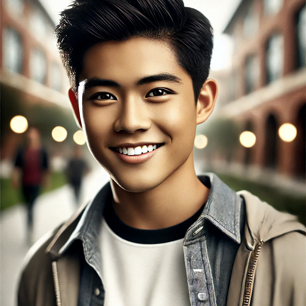

- Age: 32
- Education: MS
- Location: Chapel Hill, NC
- Occupation: Software Engineer
Originally from Mumbai, Ravi loves trying new things, especially foods he’s never had before. Open-minded, adventurous, and enjoys learning about new cultures through their cuisines. Ravi and his coworkers often order in while working on late projects. He’s excited about discovering local favorites and likes to explore new tastes whenever possible.
After that I created a user journey map of my personas’ experience to help identify possible problems and improvement opportunities.
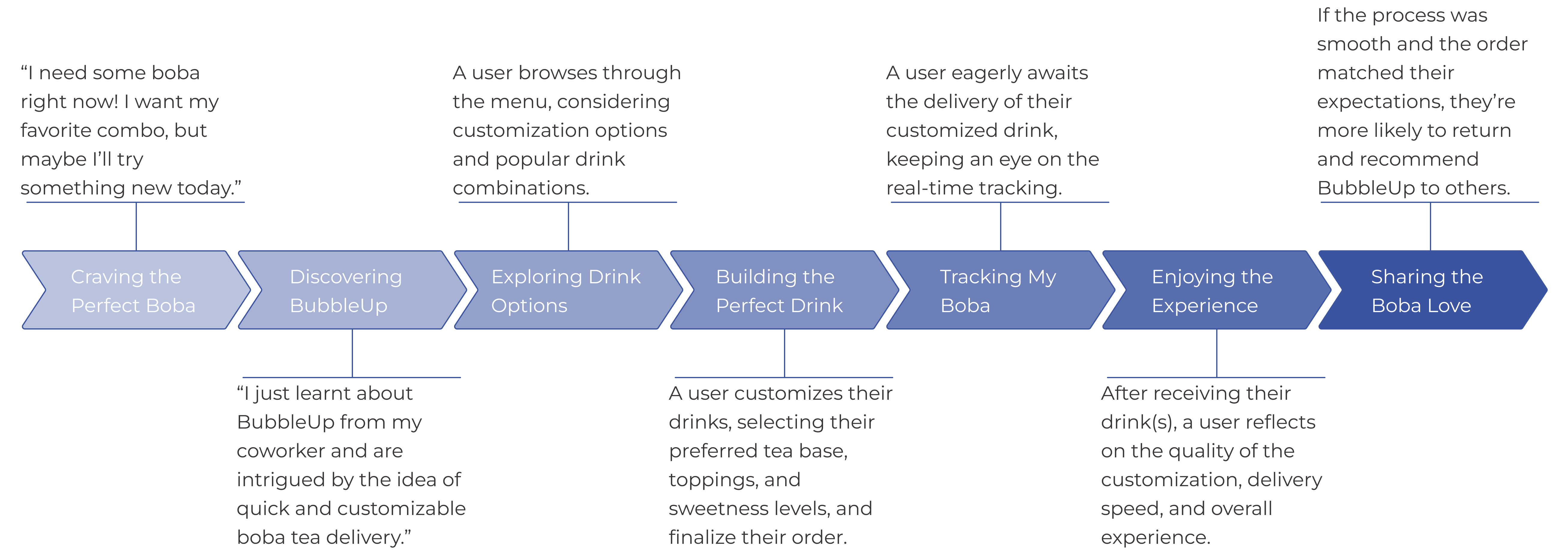
Following all the frustrations I defined one main problem statement.
Customization experience for busy users
Emma, a busy student at UNC, needs an intuitive and reliable way to customize her boba tea orders through a mobile app. However, current solutions lack a streamlined, easy-to-use customization interface, leading to incorrect orders and frustration, especially when she is short on time during study sessions.
In the Ideate stage, I can use How Might We (HMW)questions to open up creative thinking and problem-solving for the issues identified in my problem statements. These questions help brainstorm potential solutions in a broad and imaginative way.
- How might we streamline the customization process to save time for busy users like Emma?
- How might we create an interface that minimizes errors and ensures accurate orders, even during rushed moments?
- How might we offer a one-click customization option for frequent orders to make the process faster?
- How might we reduce decision fatigue for users by simplifying the number of steps required to customize their drink?
- How might we provide smart recommendations or pre-set options that Emma can easily select to fit her tastes?
- How might we speed up the ordering and delivery process during peak hours for users like Tyler and Ravi?
- How might we offer special menu items or flavor combinations that keep Tyler and Ravi’s experience fresh and exciting?
- How might we improve delivery tracking to keep socially active users informed and engaged while they wait?
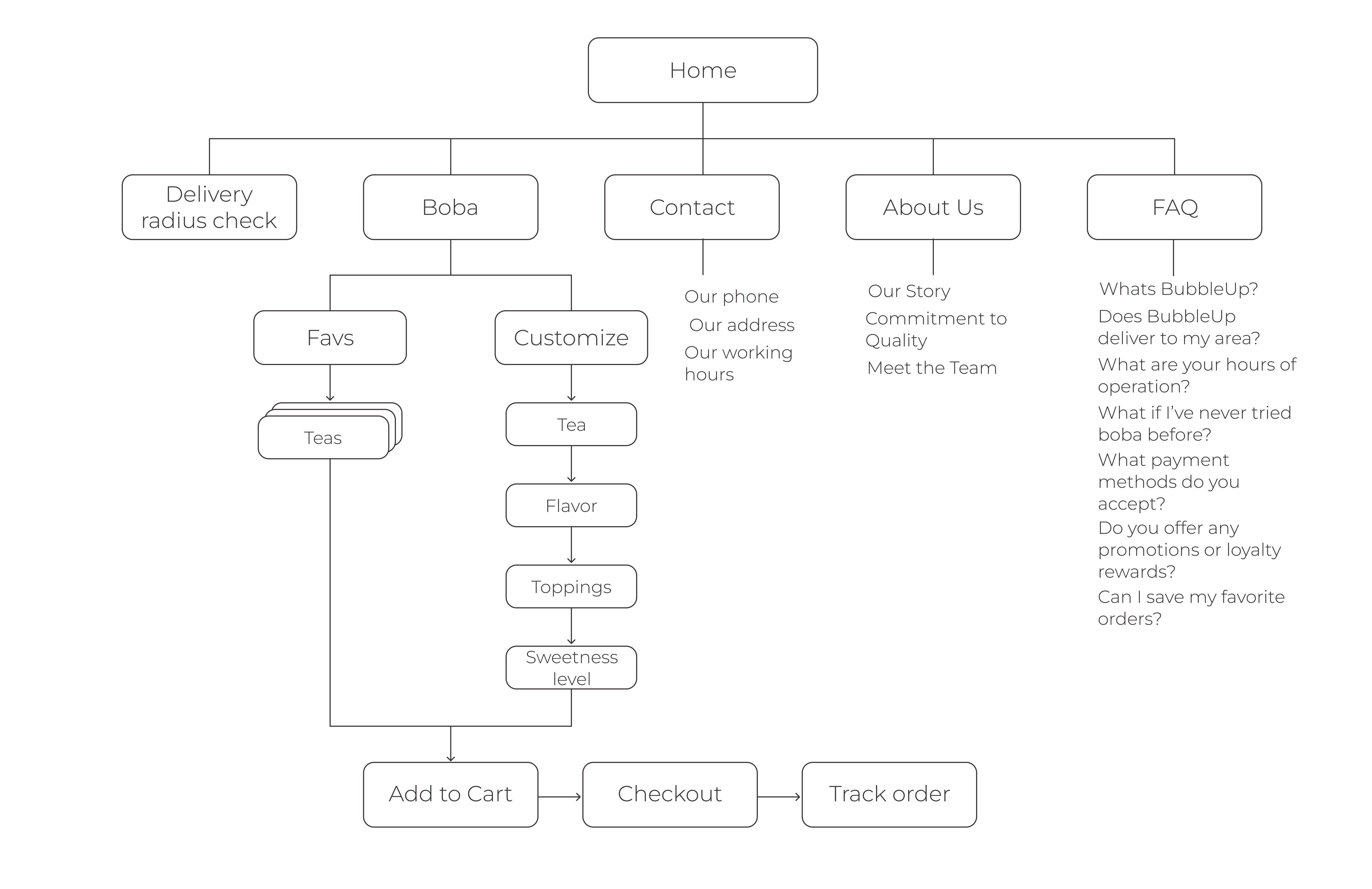
The next step I took was outlining the basic flow of the BubbleUp app by creating a detailed sitemap, mapping out each step users would take throughout the ordering process. Since navigating customization options was a significant pain point, I used that knowledge to design the sitemap. My goal was to ensure a logical, easy-to-follow structure that would enhance the overall user experience and make navigation simple and intuitive for busy and socially active users alike.
After gathering research and insights, I moved into the wire-framing and prototyping stage. I began by creating initial paper sketches to outline the app's structure, followed by low-fidelity prototypes to establish the basic layout and flow.
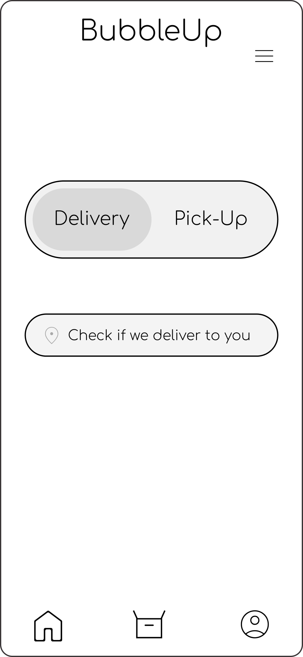
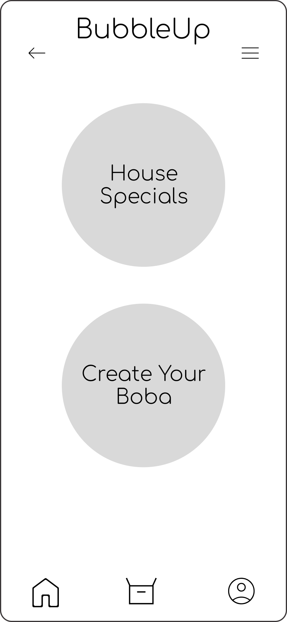

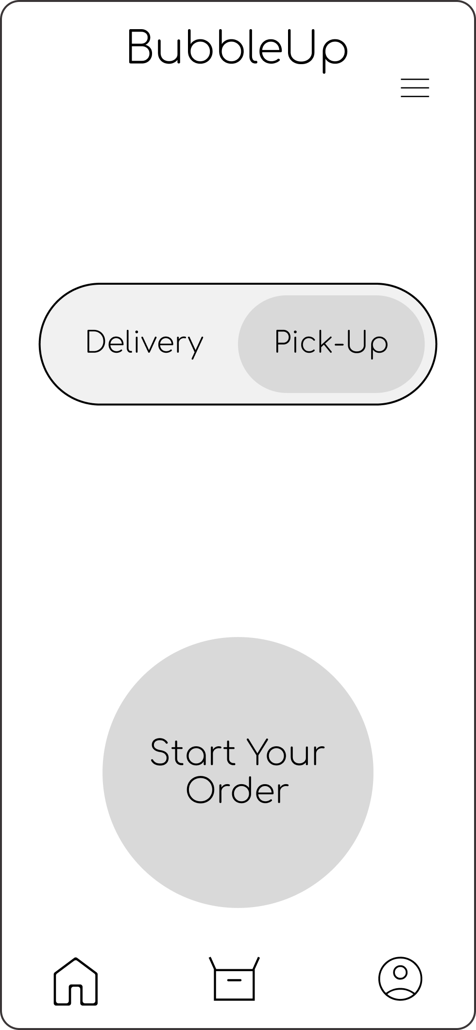

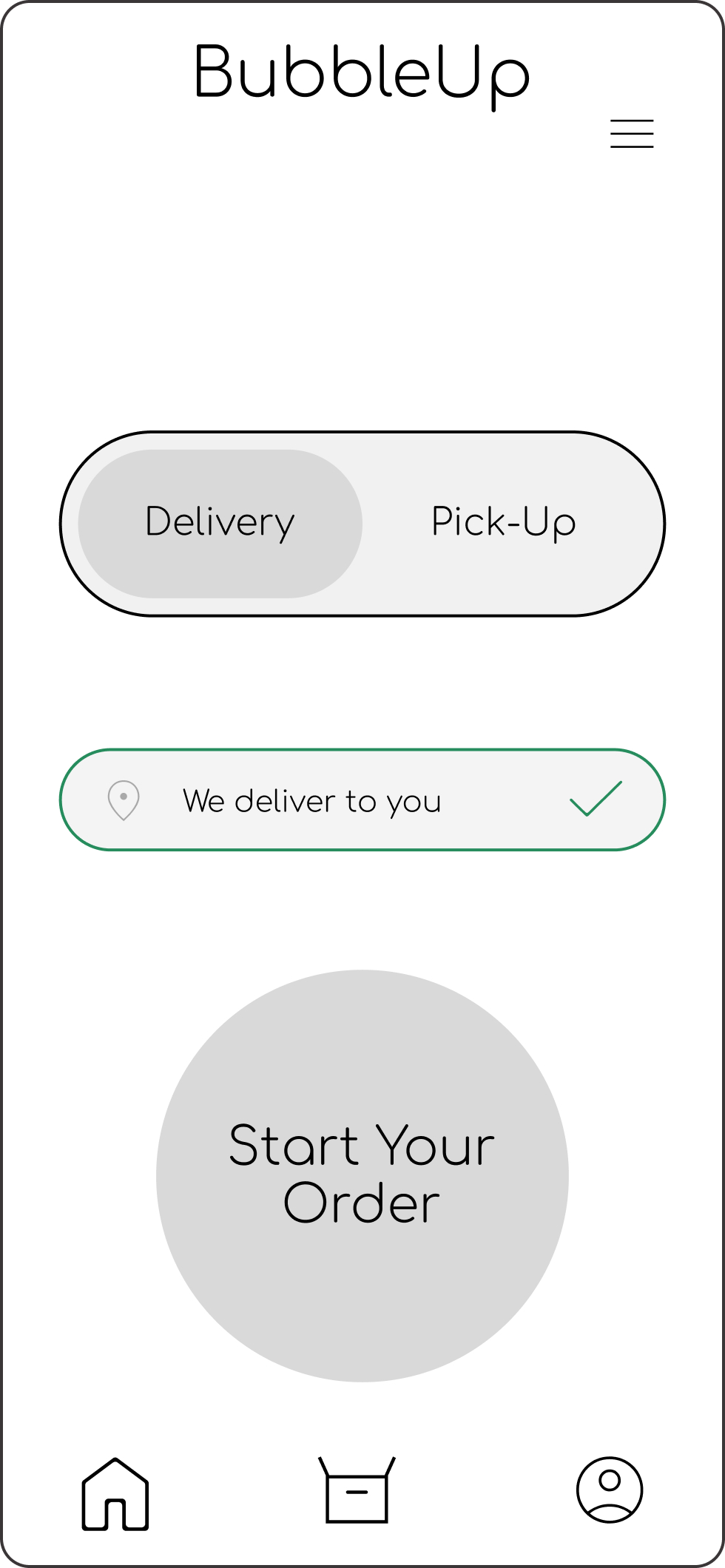
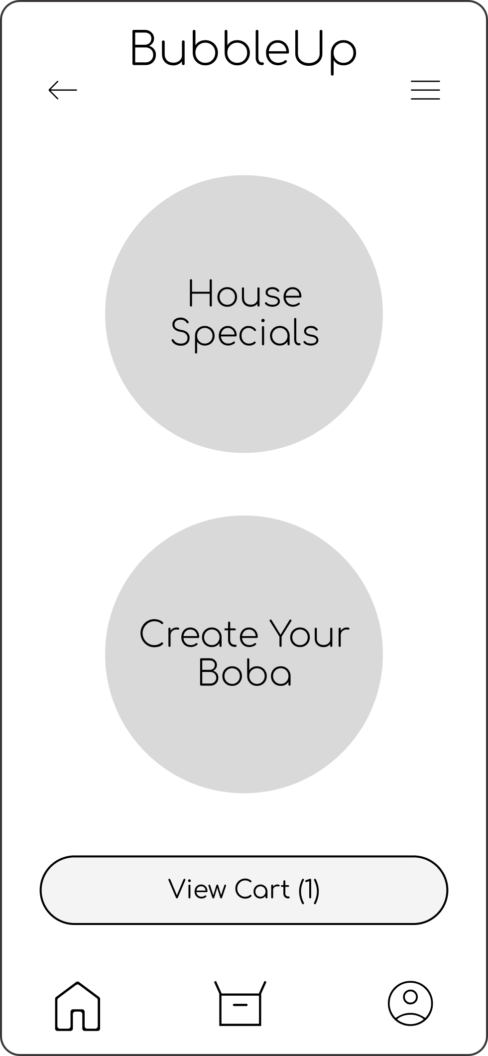
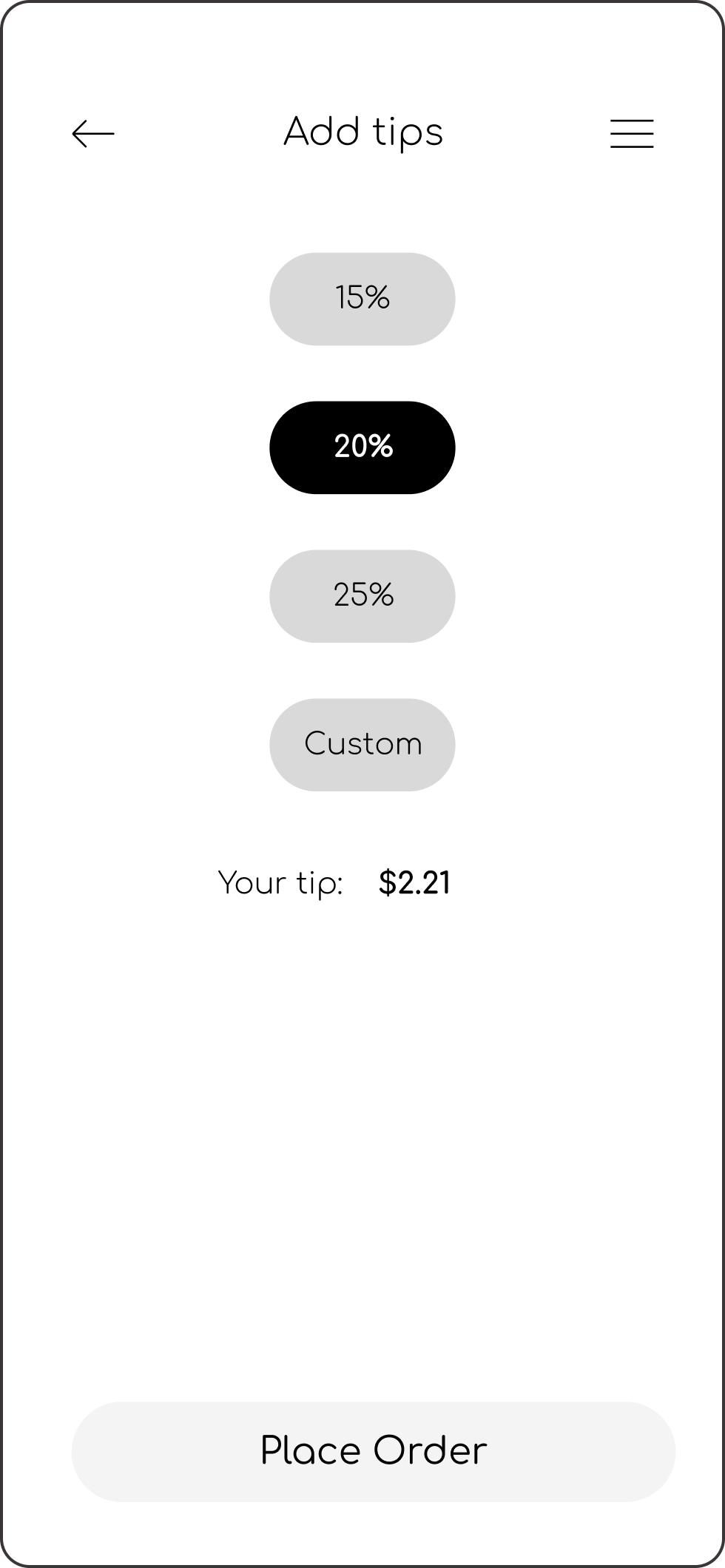
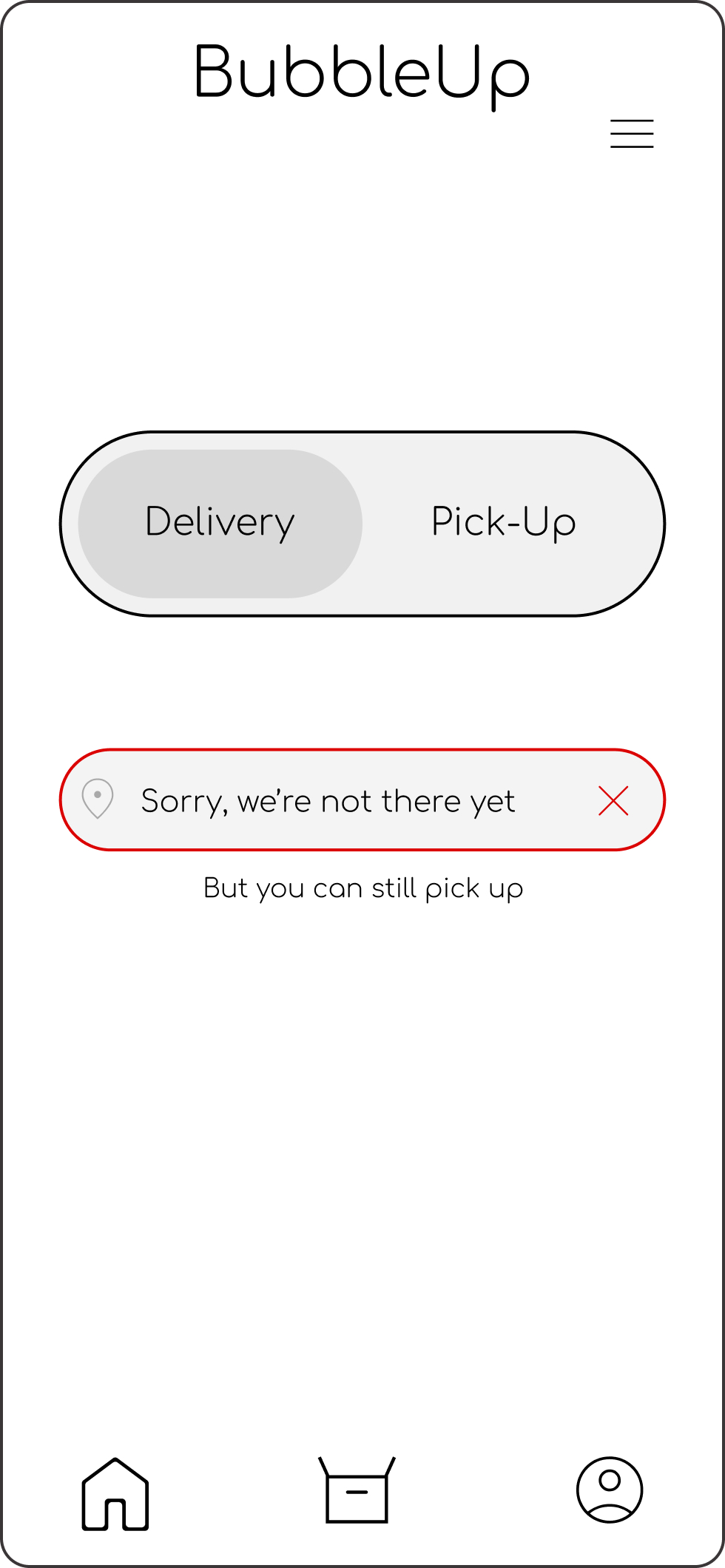
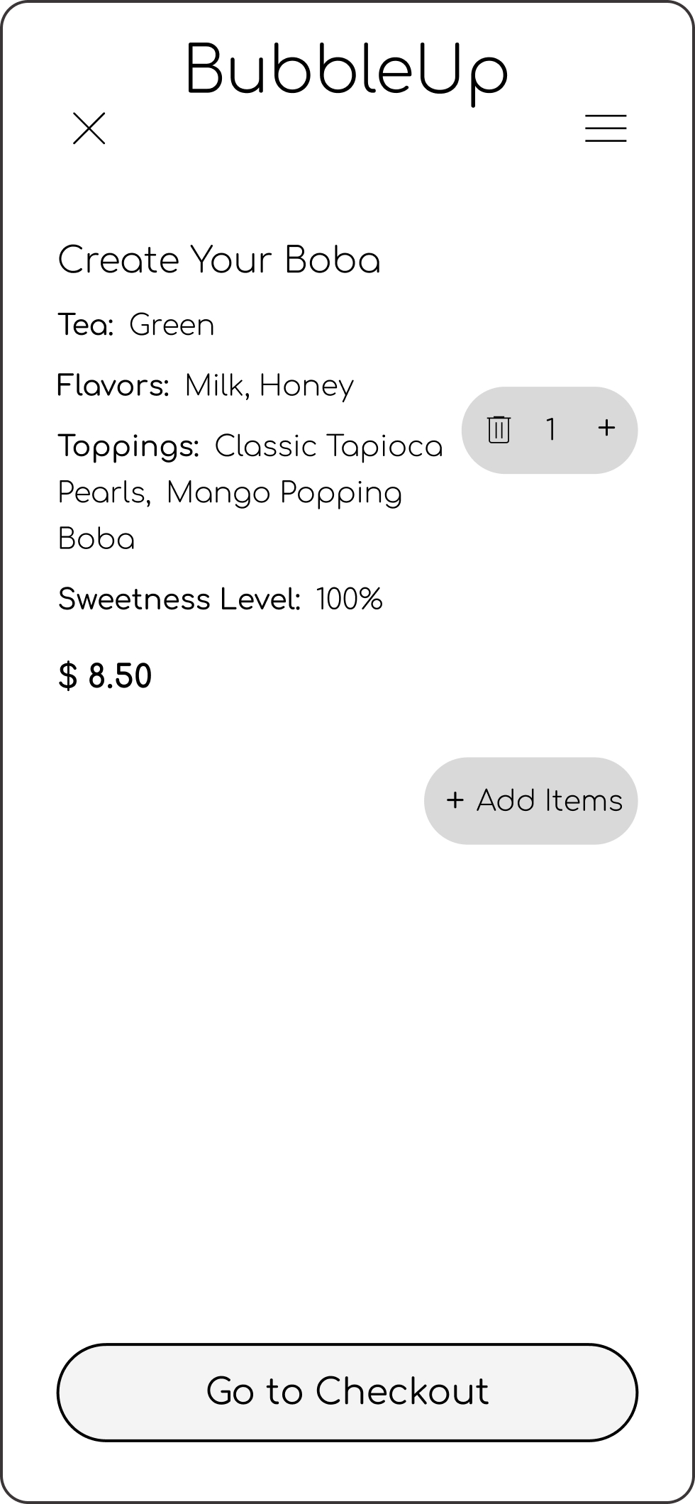
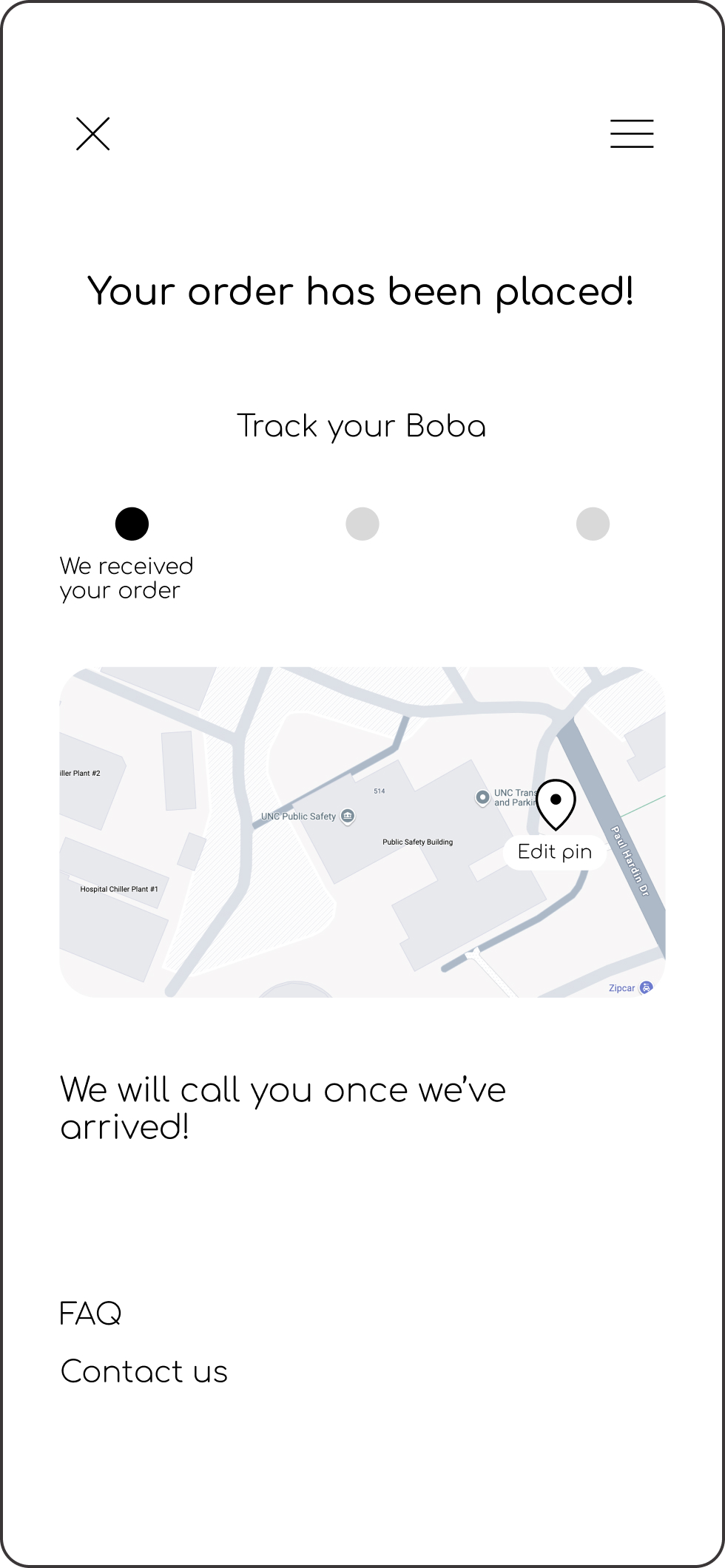

From there, I developed high-fidelity prototypes that incorporated detailed design elements, including typography, color palettes, and interactions. During this stage, I also focused on creating a logo that aligned with the app's brand identity and user experience.

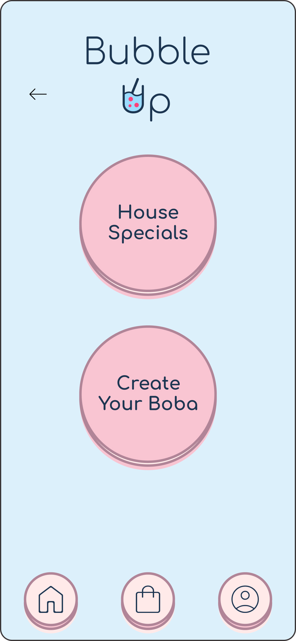

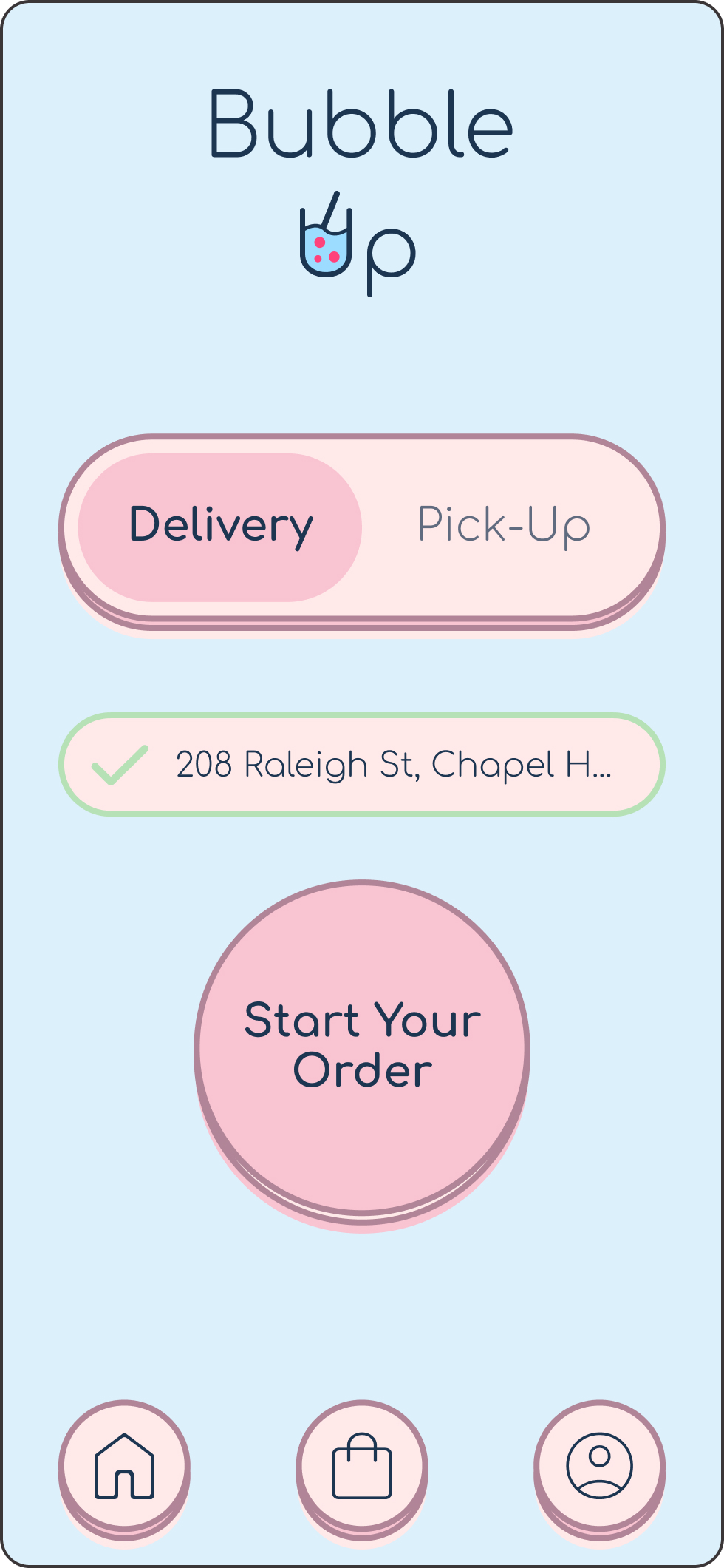

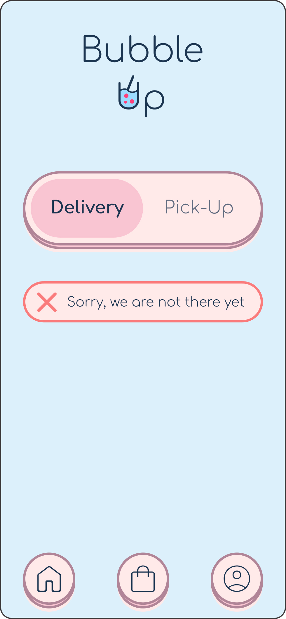
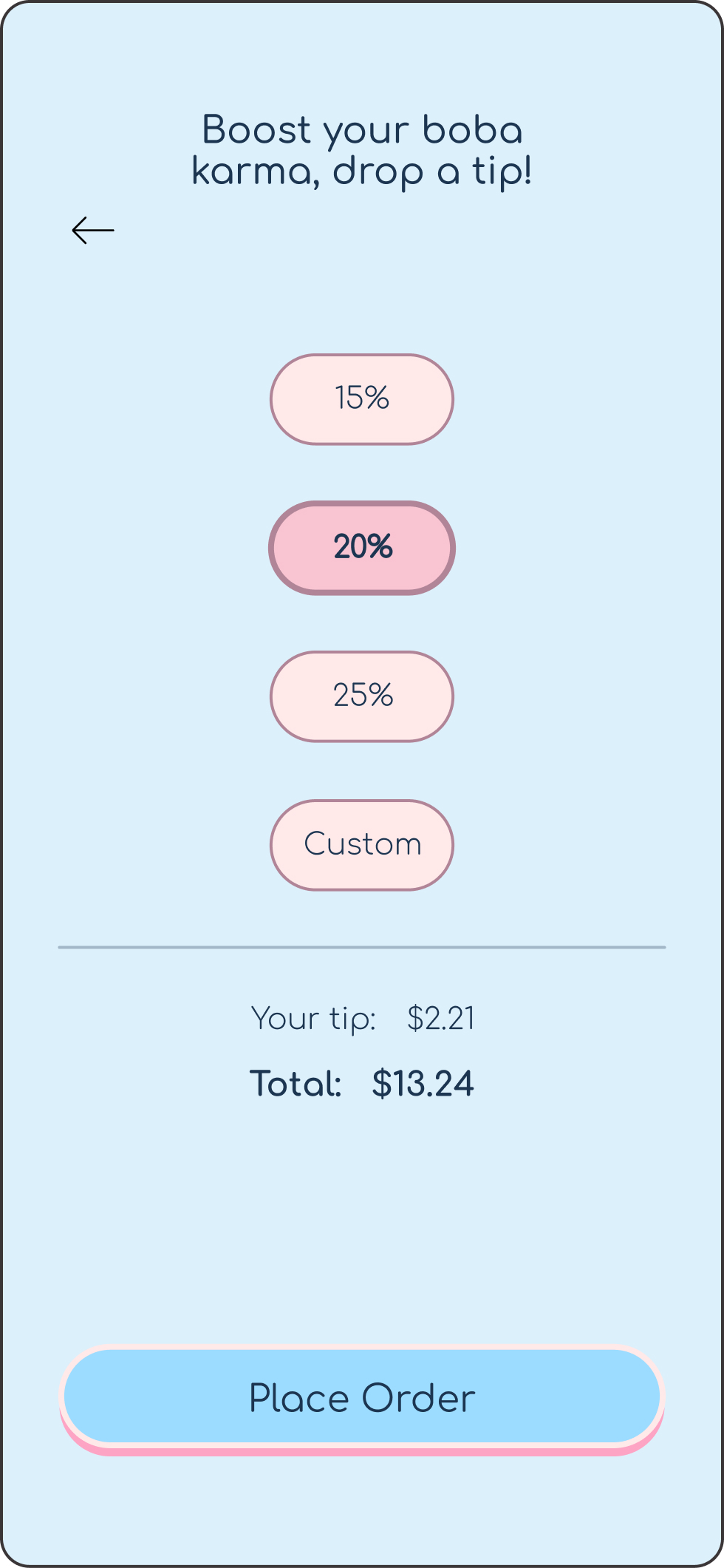
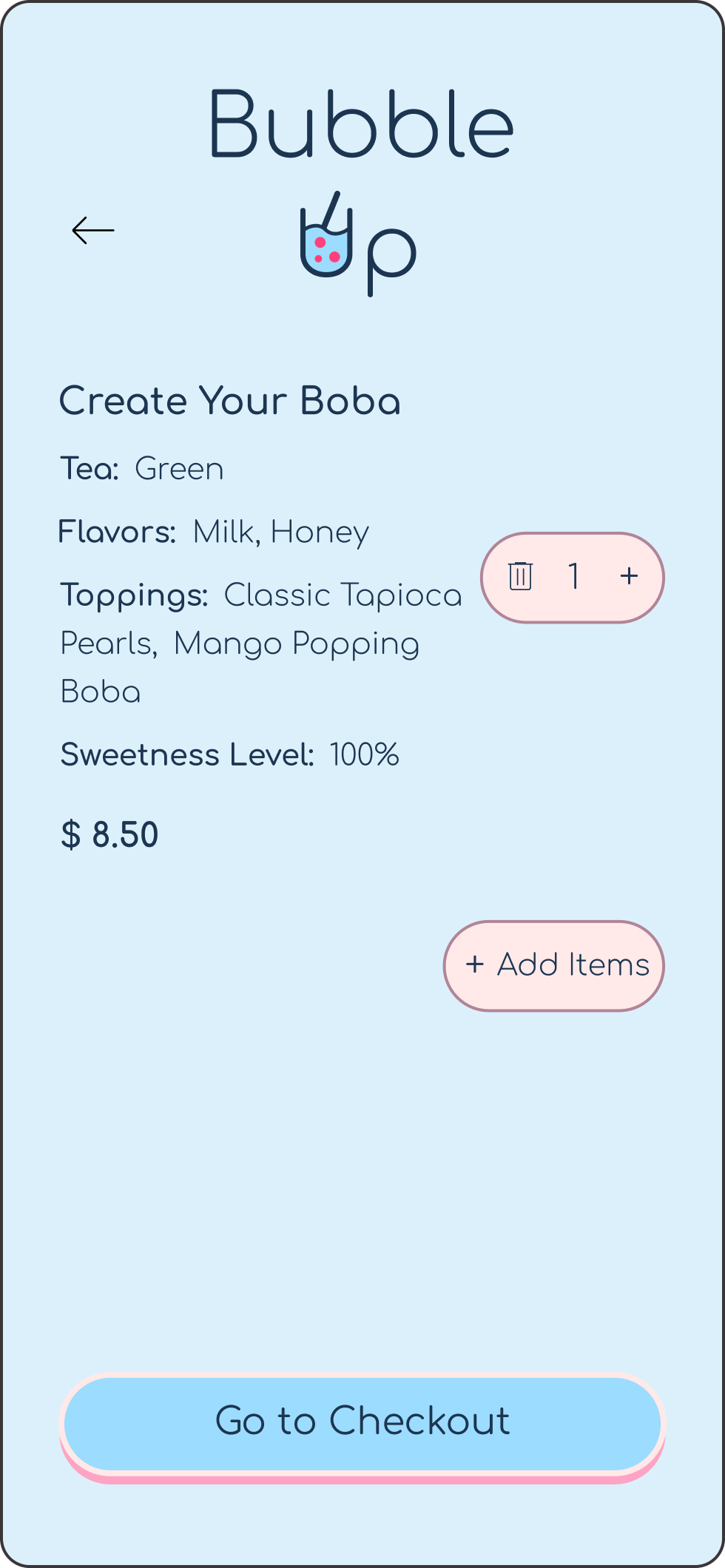
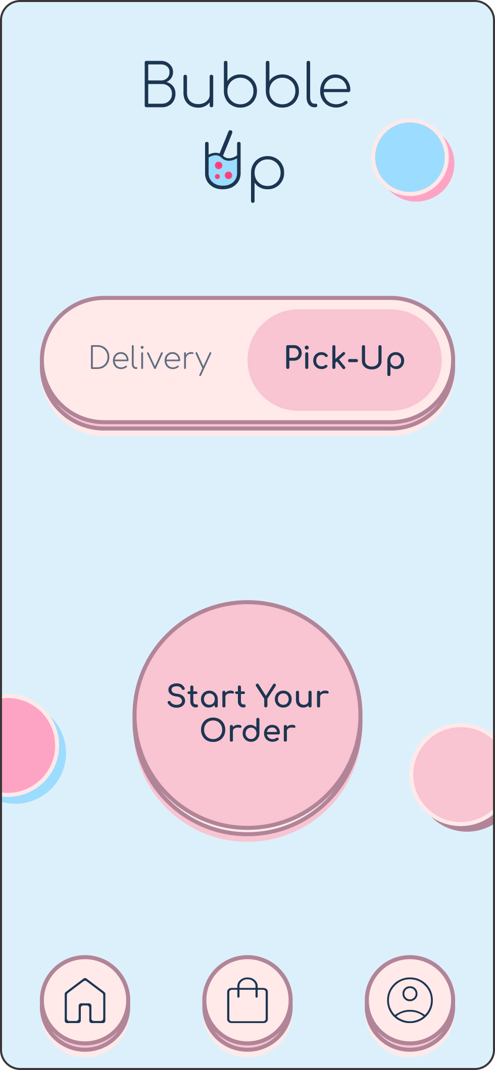

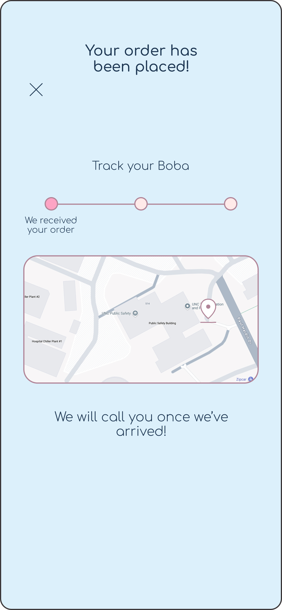
In the test stage, I conducted user testing by sharing the clickable prototype with potential users to gather feedback on the design and functionality. Their input provided valuable insights into how the app could be improved, leading to further refinements. This process helped ensure the final design aligned with user expectations and needs.
I made visual adjustments to ensure the design was more cohesive and consistent throughout the user experience.
Before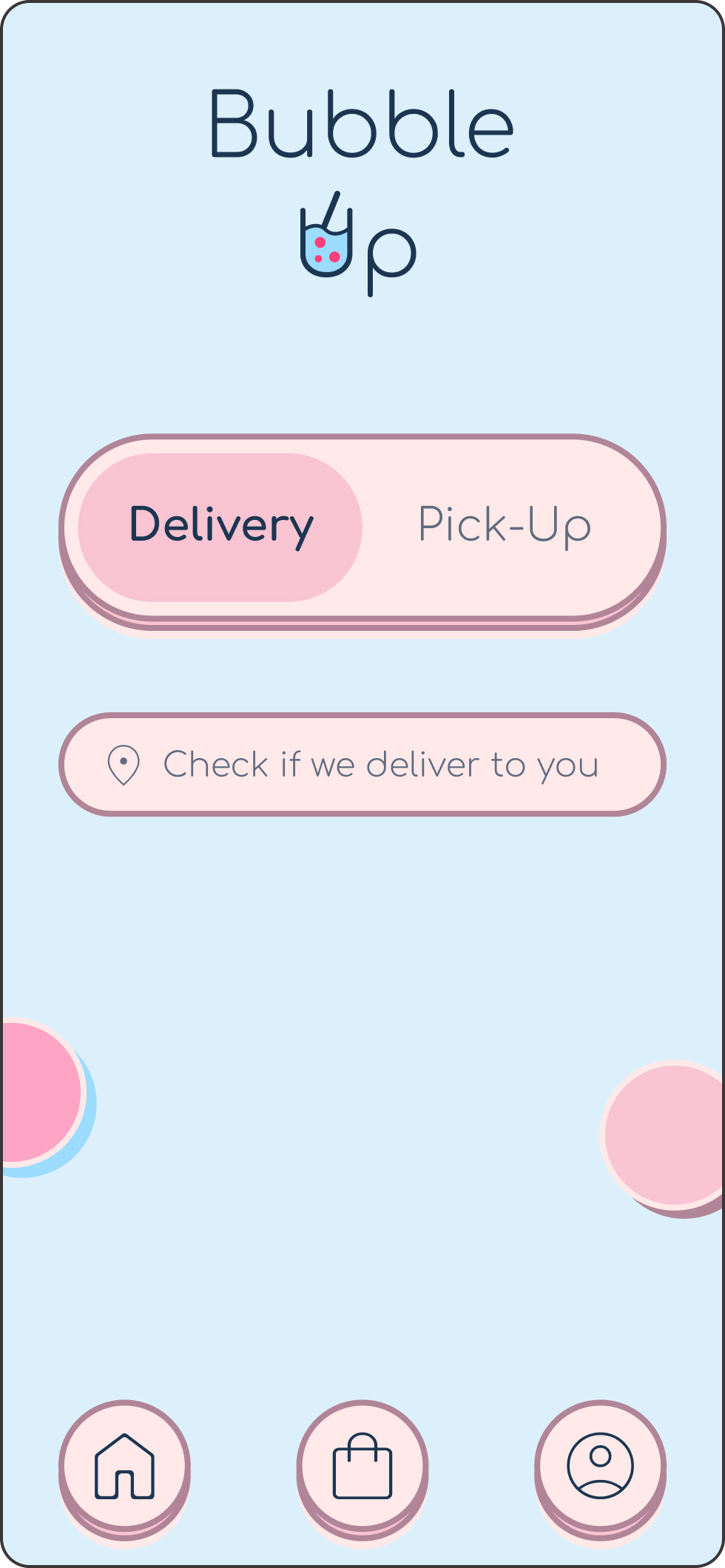
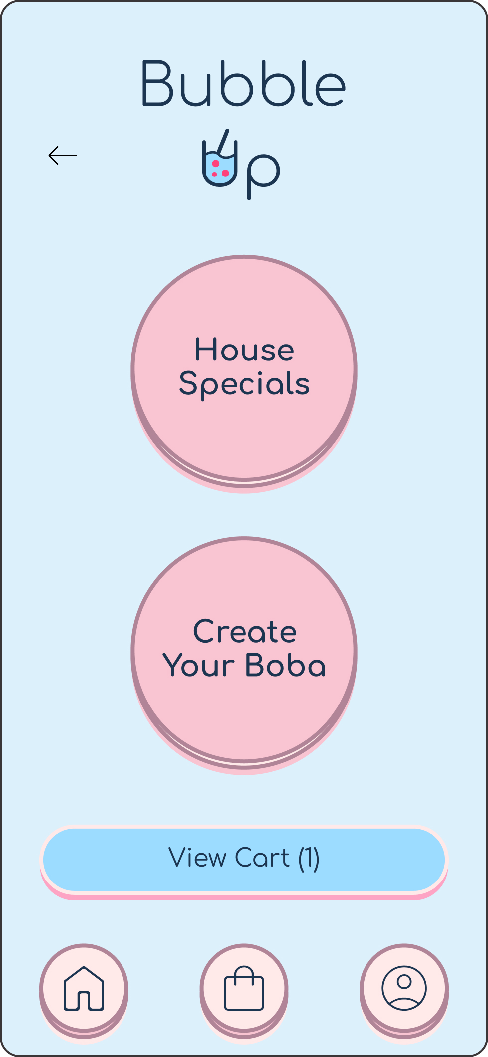 After
After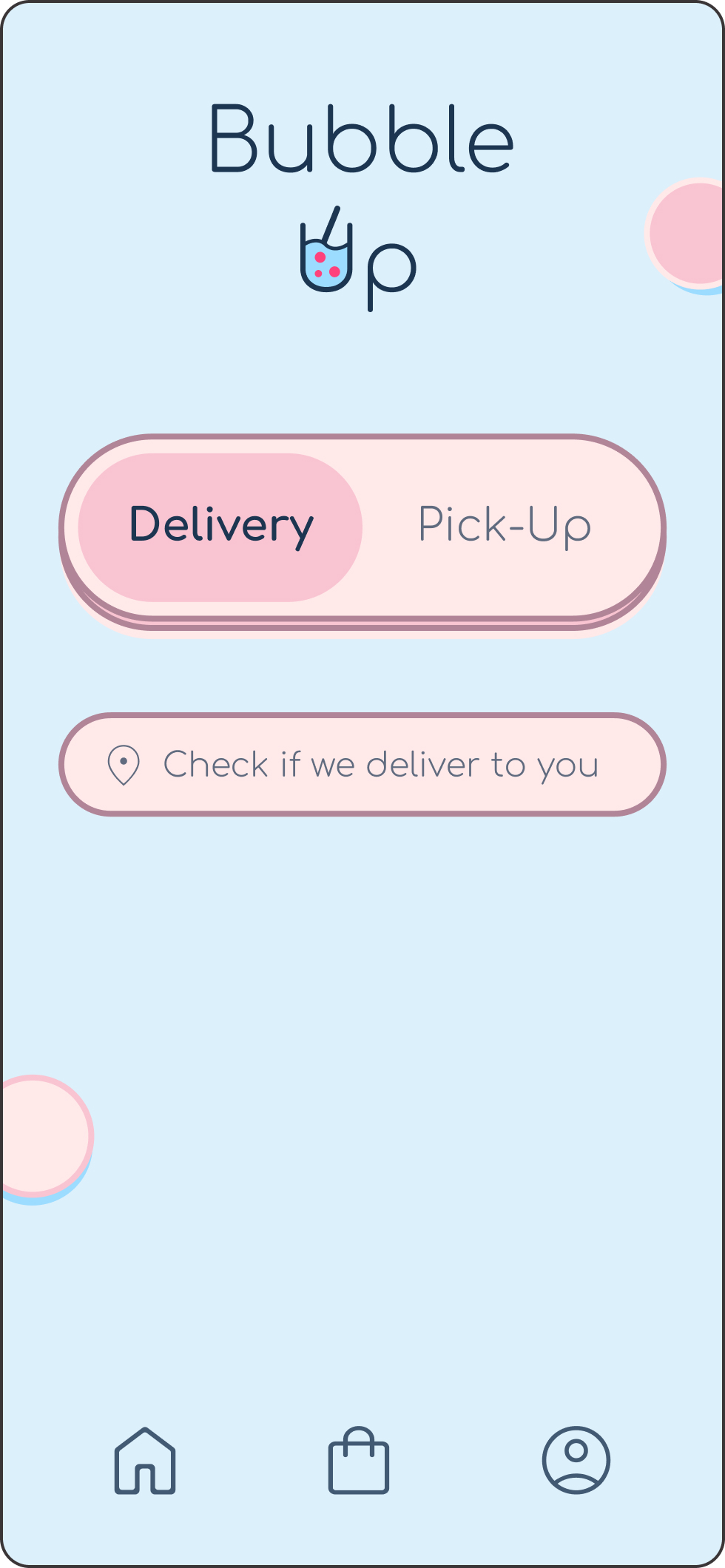
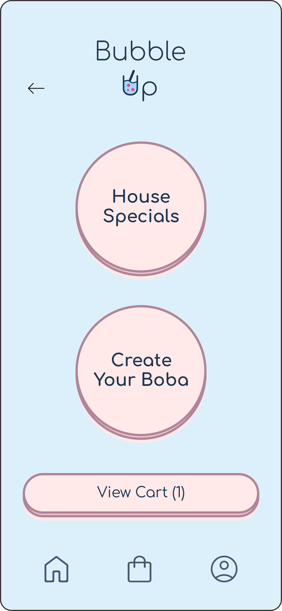
I integrated AI-generated suggestions to elevate the customization experience to a whole new level by offering smarter, more personalized options for users
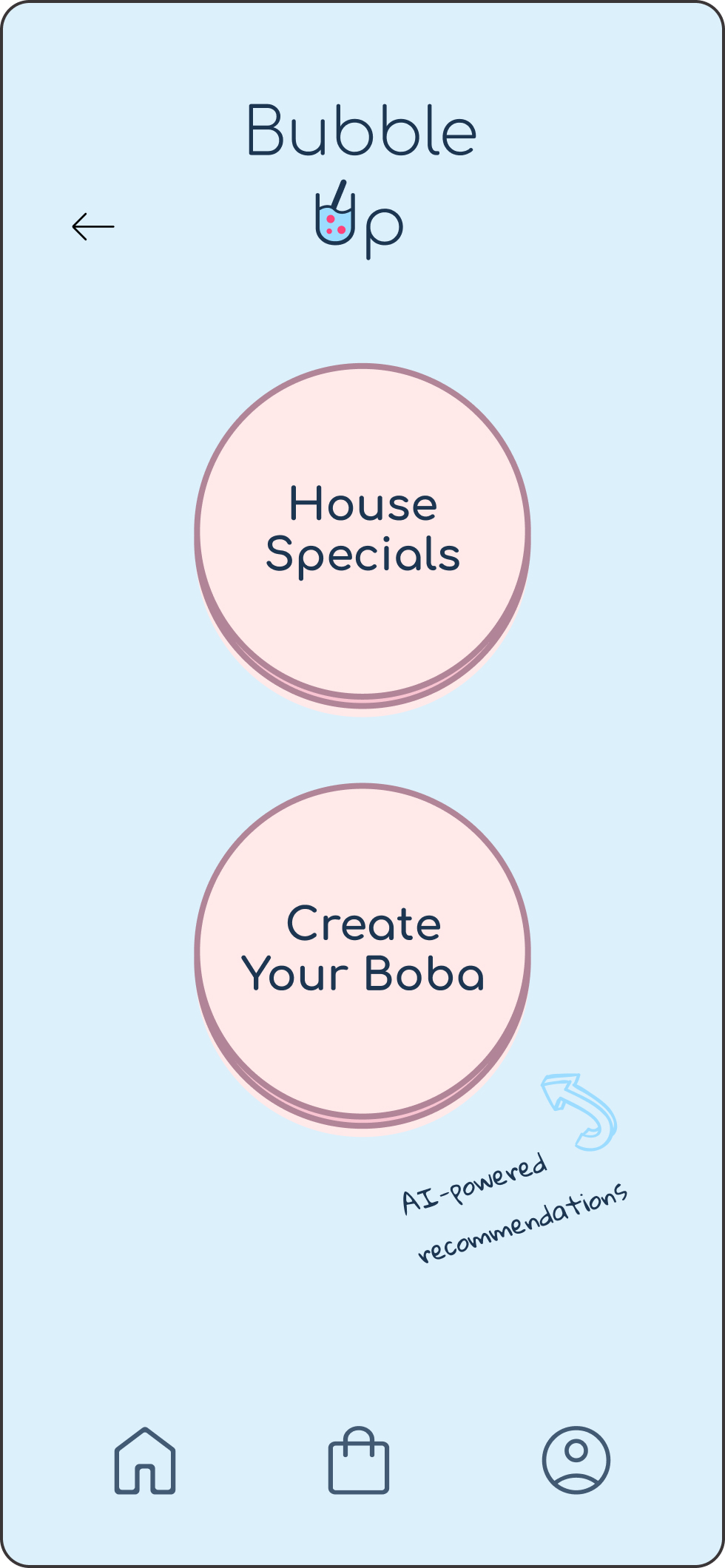
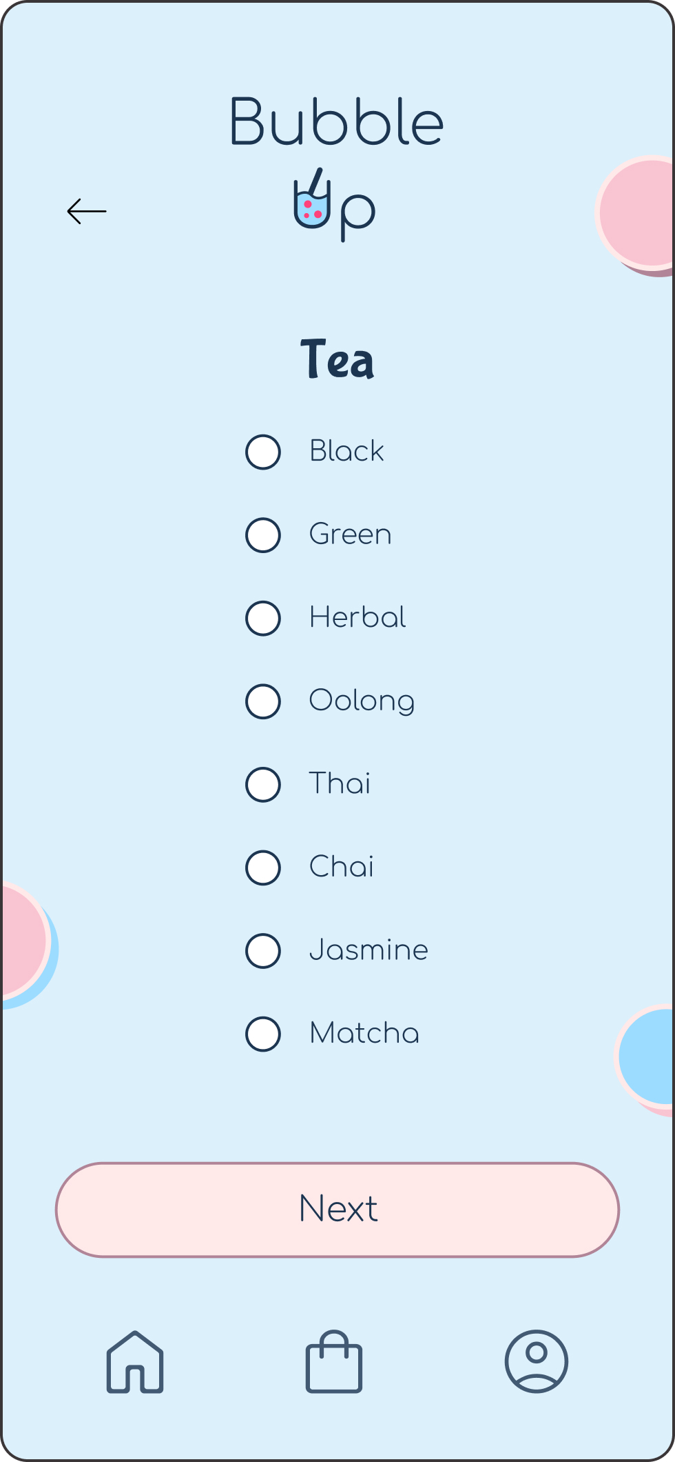
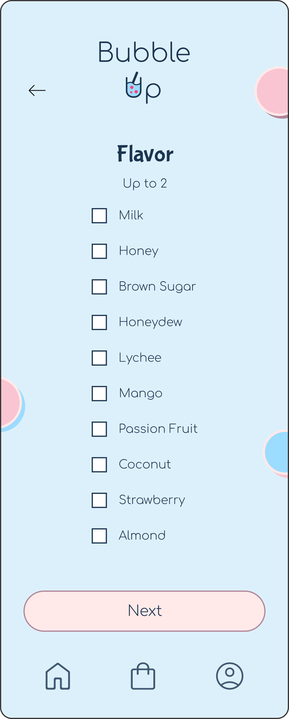
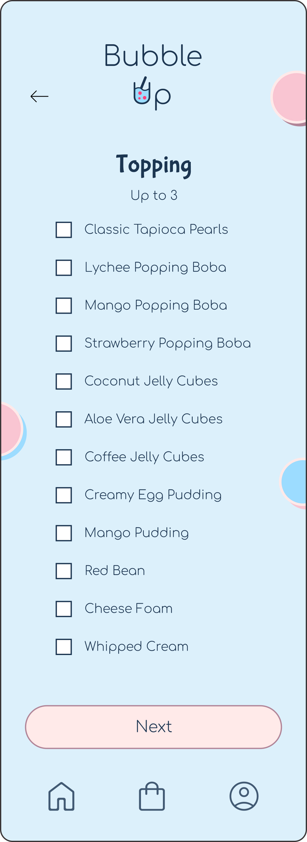
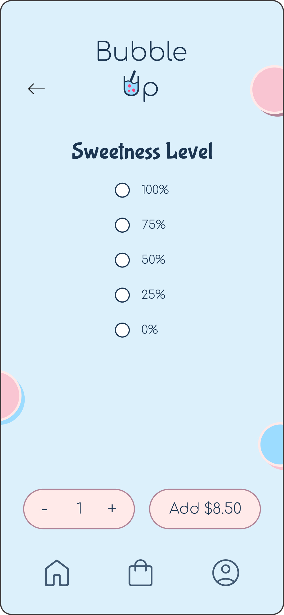
Once a user selects their base drink (e.g., tea type), the AI suggests suitable flavors, toppings, and sweetness levels. Over time, the system learns the user's preferences and begins offering personalized recommendations based on their past selections.
Moving forward, I plan to continue testing the app to validate the effectiveness of the solutions implemented for user pain points. Additionally, I will conduct further user research to uncover any new insights or areas for improvement. Based on these findings, I aim to iterate on the design and introduce updates that enhance the overall user experience, ensuring the app remains aligned with user needs.