This project is the outcome of my participation in the Google UX Design Professional Certificate program—a six-month online curriculum designed to provide individuals with entry-level UX design skills. As part of the program, I completed various assignments to build my portfolio, one of which was designing a UX/UI case study for an app. I chose to create an auction app for a potential local art gallery, which I named The Oaks Gallery. This case study explores the detailed design process involved in creating a flawless user experience tailored for art enthusiasts. It combines aesthetics with functionality to reshape the digital auctioning landscape.
- Project Duration: October - December 2023.
- My Role: UX/UI Designer
- My Responsibilities: Conducting interviews, paper and digital wire-framing, low and high-fidelity prototyping, conducting usability studies, accounting for accessibility, iterating on designs and responsive design.
- The Problem: The members of the gallery lack convenient access to the auctions organized by The Oaks Gallery.
- The Goal: Design a simple app, that can offer gallery’s members more flexibility with auction attendance and to enrich the relationship between the gallery and its members while promoting a vibrant and interactive art community.
I conducted user interviews, which I then turned into empathy maps to better understand the target user and their needs. Art auction apps tend to be visually dense with a wide array of artworks, artist profiles, auction details, and bidding options. That’s why my primary objective was to understand common challenges and frustrations people face while navigating such a complex app.
Analyzing the different insights and recurring themes from users' responses allowed me to create two personas, which represent that information in character form.

- Age: 38
- Education: BBM
- Location: Raleigh, NC
- Family: Married
- Occupation: Marketing Director
- Discover new artworks and artists
- Expand her art collection
- Bid on art pieces that align with her taste
- Wants a user-friendly and efficient platform for art auctions that simplifies the process.
- Limited time for art auctions due to her busy work schedule
- Lack of a platform that respects and accommodates her limited availability
- Difficulty in navigating complex auction apps
Laura, a dynamic marketing director living with her spouse in Raleigh, NC, is deeply passionate about art. Besides her role as a member of the local art gallery, she's an avid traveler. Her wanderlust takes her to art capitals around the world, where she immerses herself in diverse cultures and artistic traditions. Laura's globetrotting experiences not only enrich her collection but also infuse her marketing strategies with a global perspective.

- Age: 55
- Education: BE
- Location: Cary, NC
- Family: Divorced with two grown children
- Occupation: Retired Engineer
- Explore the local art scene
- Start collecting art
- Invest in artworks that catch his eye
- Have guidance to make his art collecting journey enjoyable and accessible
- Complexity and lack of user-friendliness in current art auction apps
- Overwhelmed by the intricacies of the process
- Lack of guidance and support for new art collectors
Eric, a divorced retired engineer with grown children who have moved out, now resides in a suburban neighborhood of Raleigh, NC. In his free time, he's an avid birdwatcher, finding solace and fascination in observing the local species in his quite backyard. He's recently delved into the world of art exploration and collection during his retirement years, seeking enriching experiences. Despite being tech-savvy, he's a novice in art collection and auction apps.
After that I created a user journey map of my persona’s experience to help identify possible problems and improvement opportunities. Following all the frustrations I defined 2 problem statements.
- A busy marketing director, art enthusiast and collector, Laura, needs a user-friendly and efficient platform to access local art gallery auctions, because she wants to expand her art collection while accommodating her tight schedule.
- A retired engineer and aspiring art collector, Eric, needs guidance and support on how to navigate art auctions effectively, because he wants to initiate his art collection and participate in auctions with confidence.
- HMW simplify the process of art auction dynamics for users to feel confident in navigating auctions?
- HMW provide users with educational resources and guidance tailored to their level of expertise as they begin their art collection journey?
- HMW design a user-friendly digital platform that streamlines access to local art gallery auctions for users’ convenience?
- HMW enhance the platform with features such as curated recommendations and artist insights to assist users in making informed decisions and expanding their art collection efficiently?
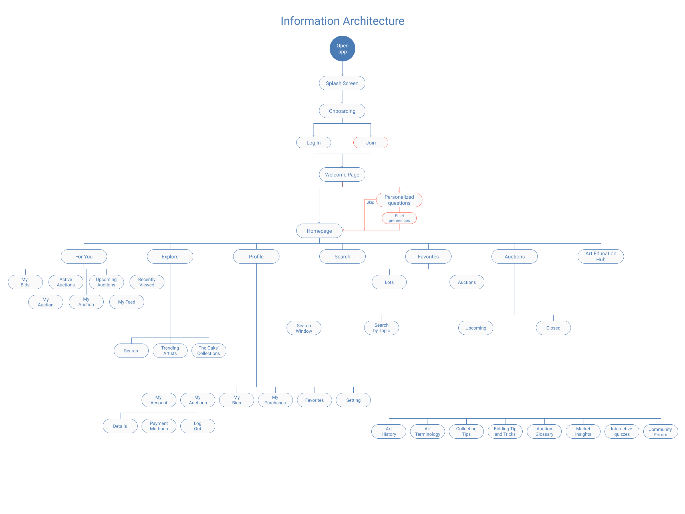
The next thing I did was outline the basic flow of the app, mapping out each step users would take as they go through the process. Difficulty with auction app’s navigation was a primary pain point for users, so I used that knowledge to create a sitemap. My goal here was to make strategic information architecture decisions that would improve overall app navigation. The structure I chose was designed to make things simple and easy.
The aim of prototyping stage was to turn my ideas into something tangible which can be tested on real users.
I began sketching out potential solutions, keeping the user pain points about navigation, browsing, and checkout flow in mind.
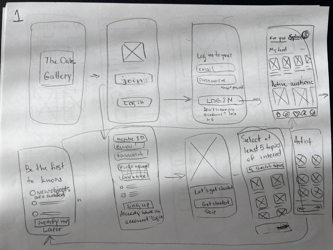
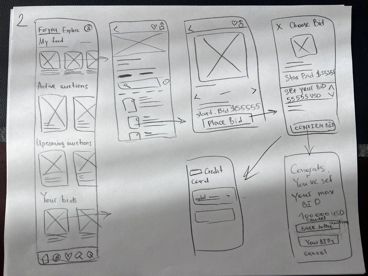
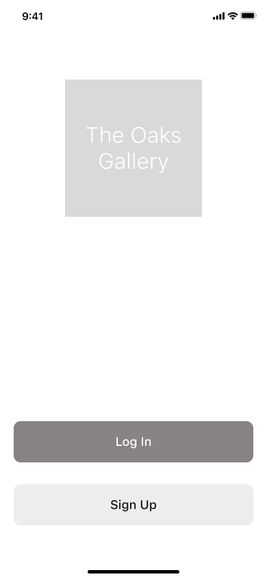
Switching from paper to digital wireframes helped me better see how the design could fix problems users have and make their experience better. A big part of my plan was deciding where to put important buttons and visuals on the main page.

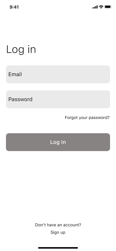

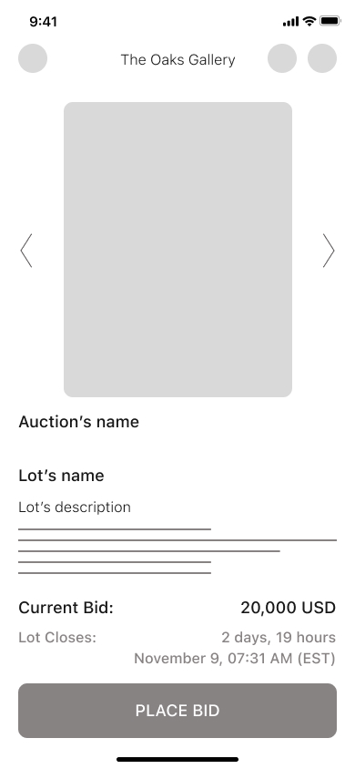
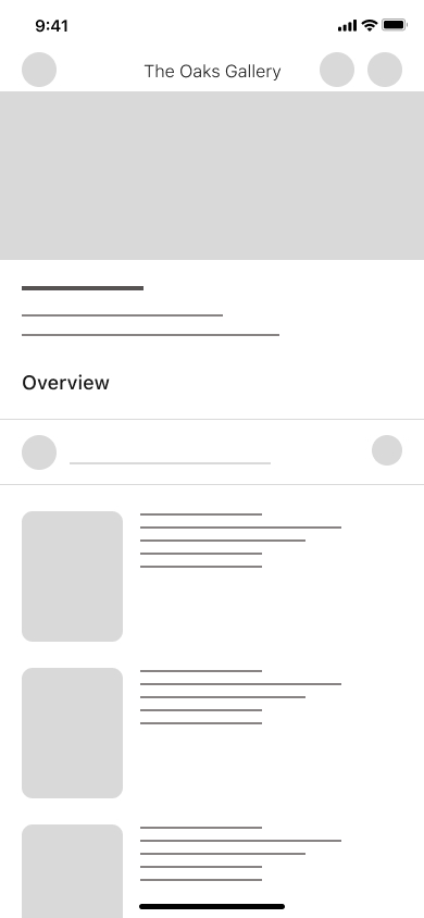
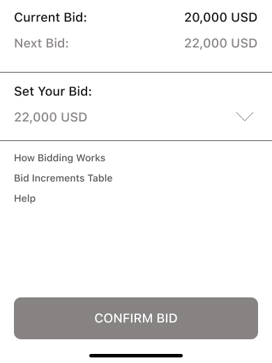
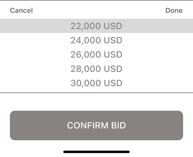
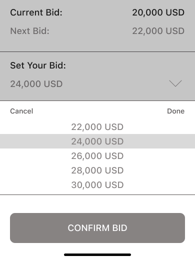
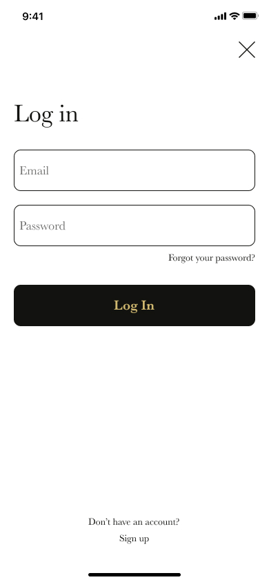
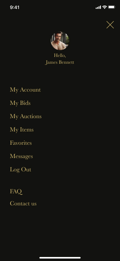

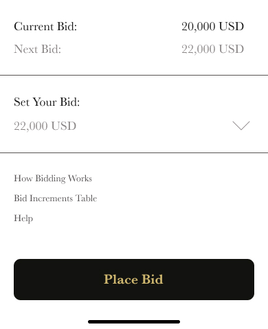
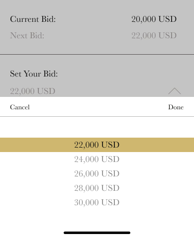


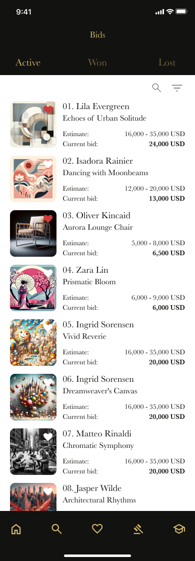
I conducted user testing by sharing my clickable prototype with a group of potential users and asking for their feedback. The valuable insights I received prompted me to revisit and refine the design based on their input.
I highlighted the section of the app where the user is currently located.
BeforeAfterI implemented a new color scheme to indicate different statuses: users can now easily recognize their own bids and when their bids have been outbid.
Before After
After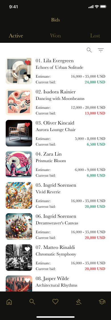
I added the Help button under every lot in case users get questions.
Before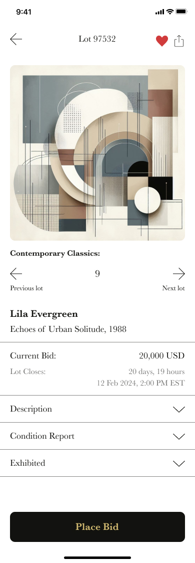 After
After
In the future, I aim to continue testing to validate the effectiveness of the solutions implemented for user pain points. Additionally, I plan to conduct further user research to identify and address additional areas requiring updates.